
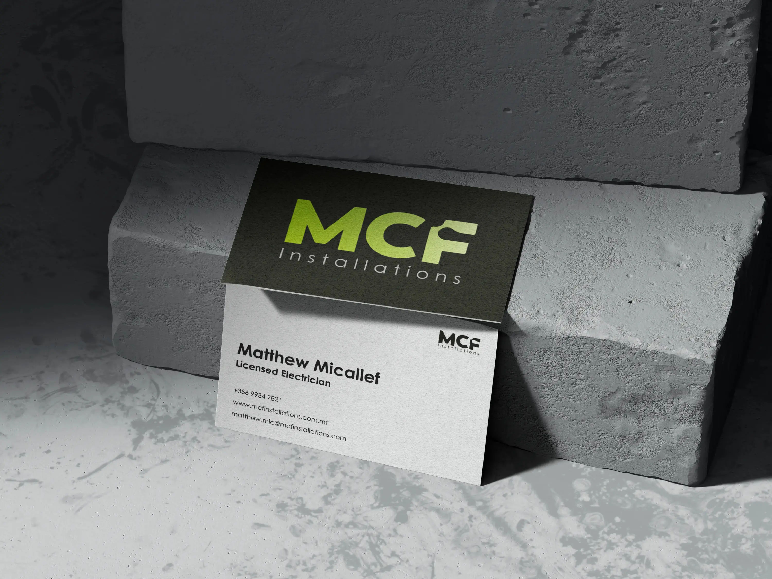
MCF
Installations
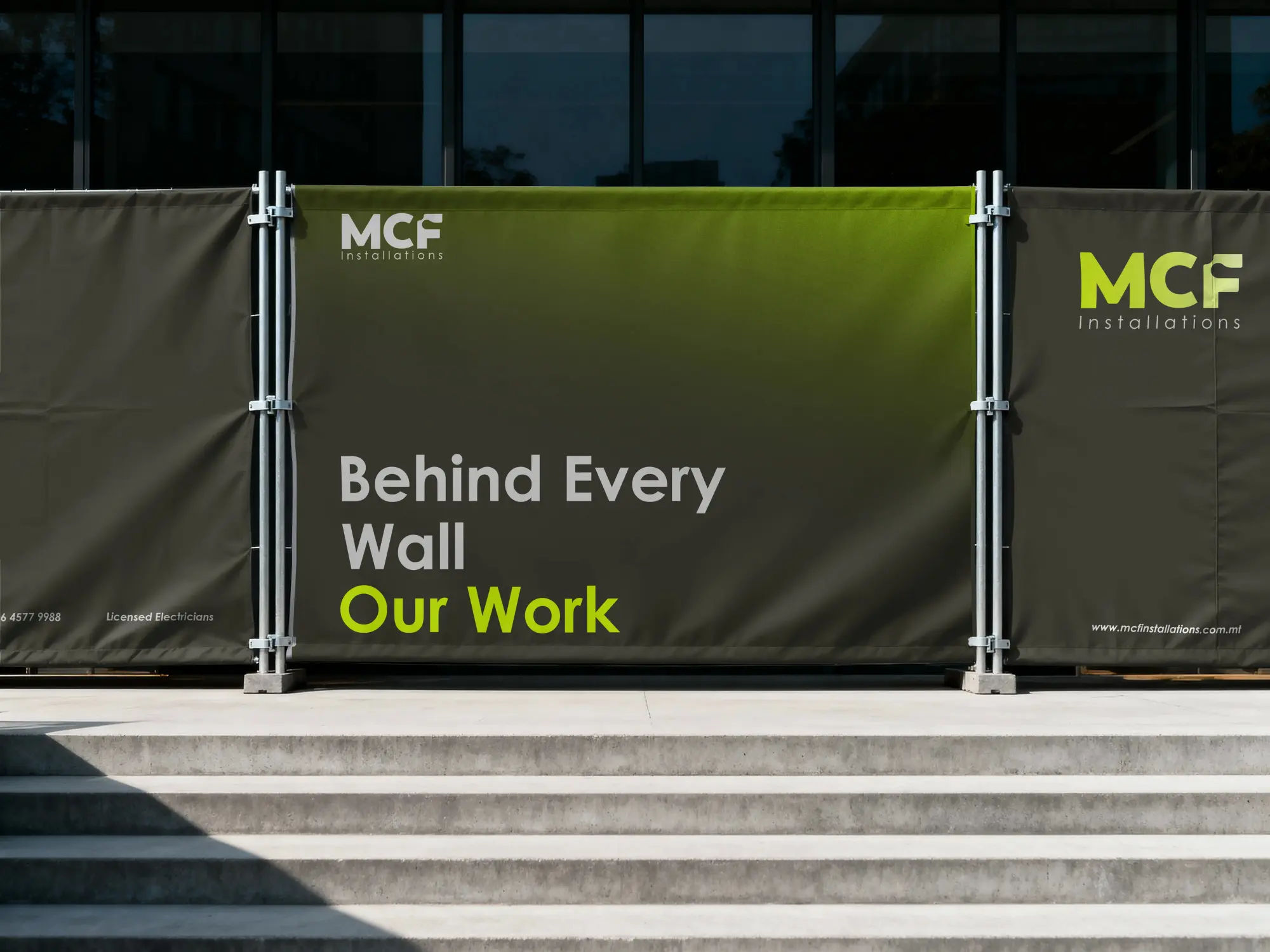
A full brand identity for MCF Installations, a Malta-based electrical contracting company.
The brief called for a visual identity that projected confidence and competence, something that would work across vehicles, uniforms, stationery, and digital platforms without feeling generic or overly corporate.
The electrical and construction sector in Malta is crowded with businesses that rely on word-of-mouth and have little investment in visual identity. MCF wanted to stand apart, not just as a capable contractor, but as professionals that take pride in every aspect of their work, including how they present themselves.
The challenge was building a brand that felt genuinely premium without losing the approachability and directness that small business clients expect. It needed to be bold enough to work on the side of a van, refined enough to sit on a proposal document, and consistent enough to scale as the business grows.
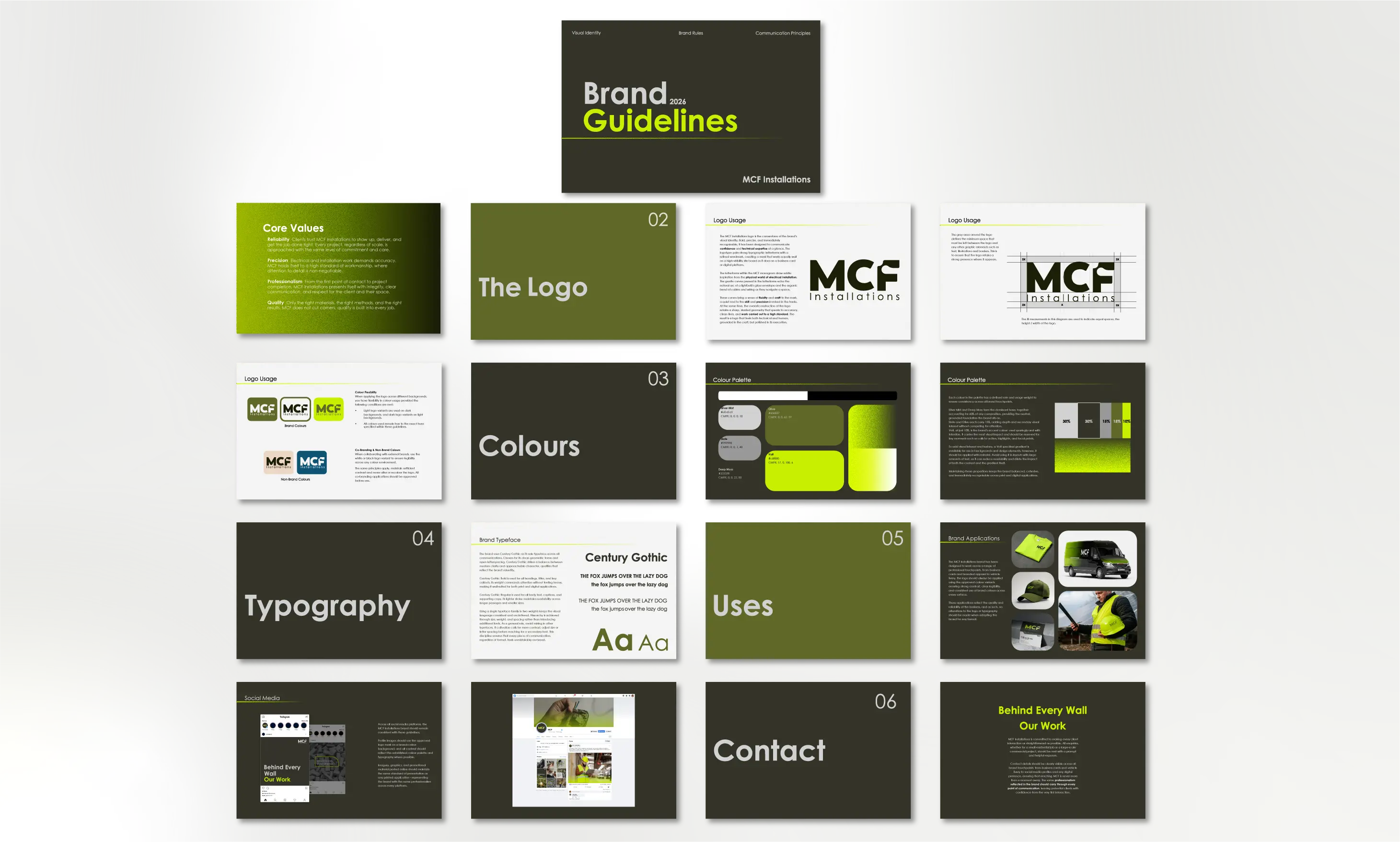
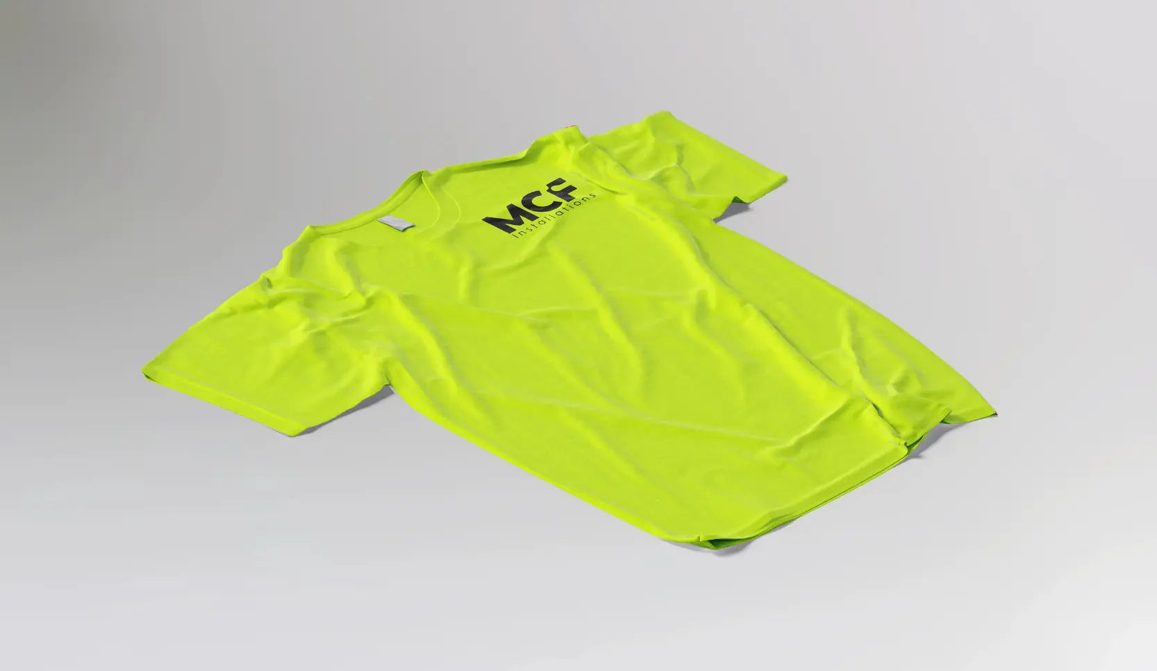
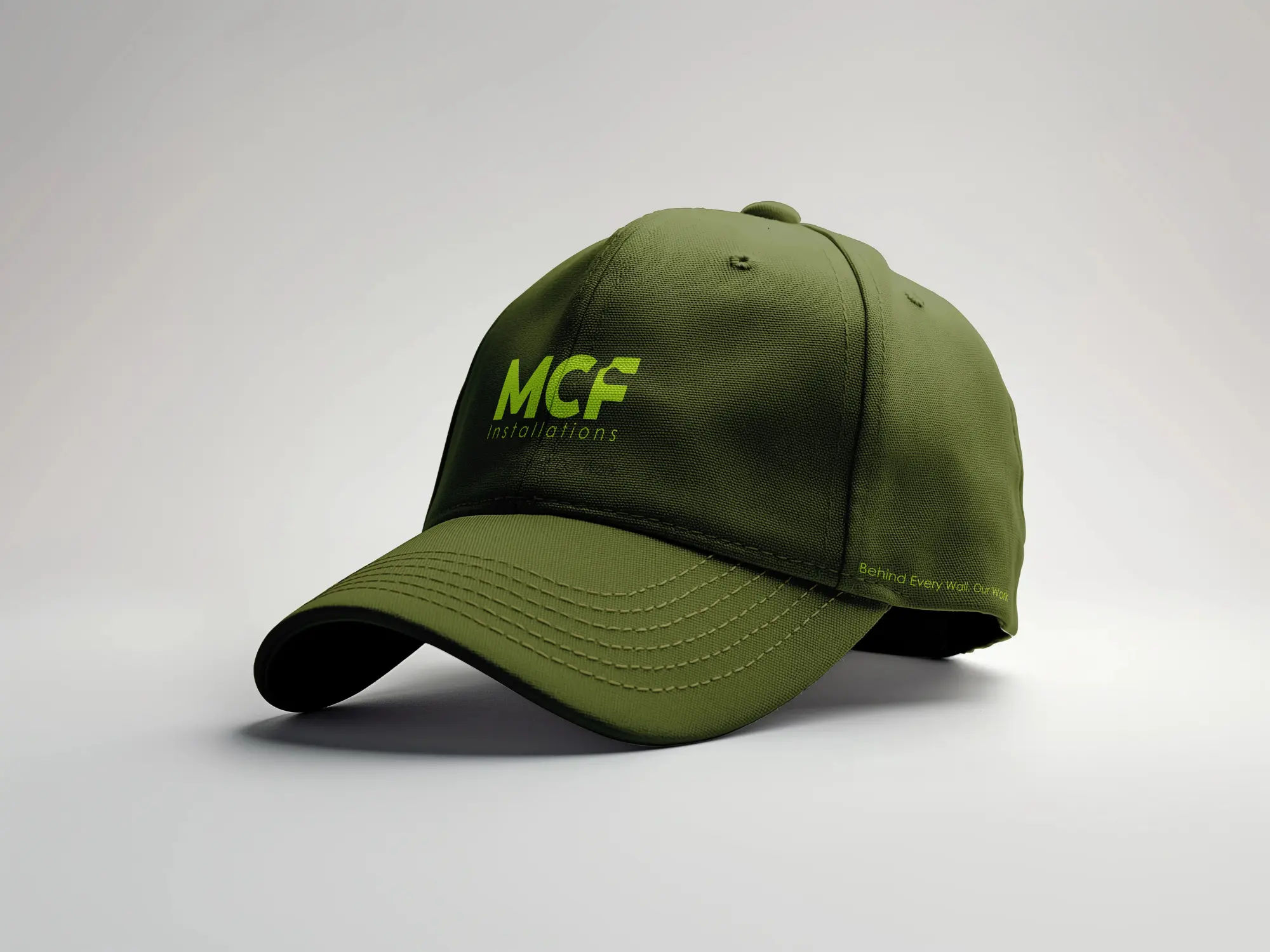
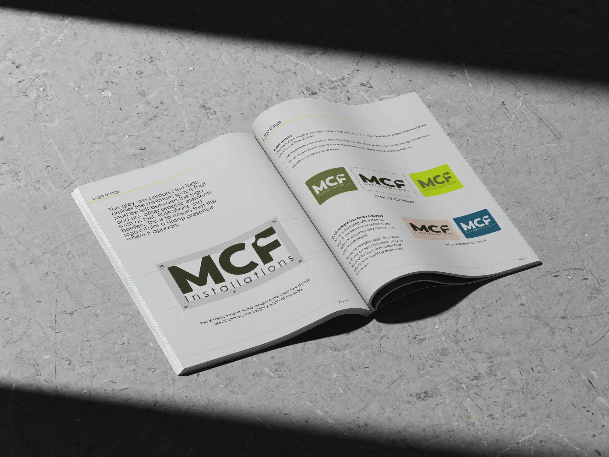
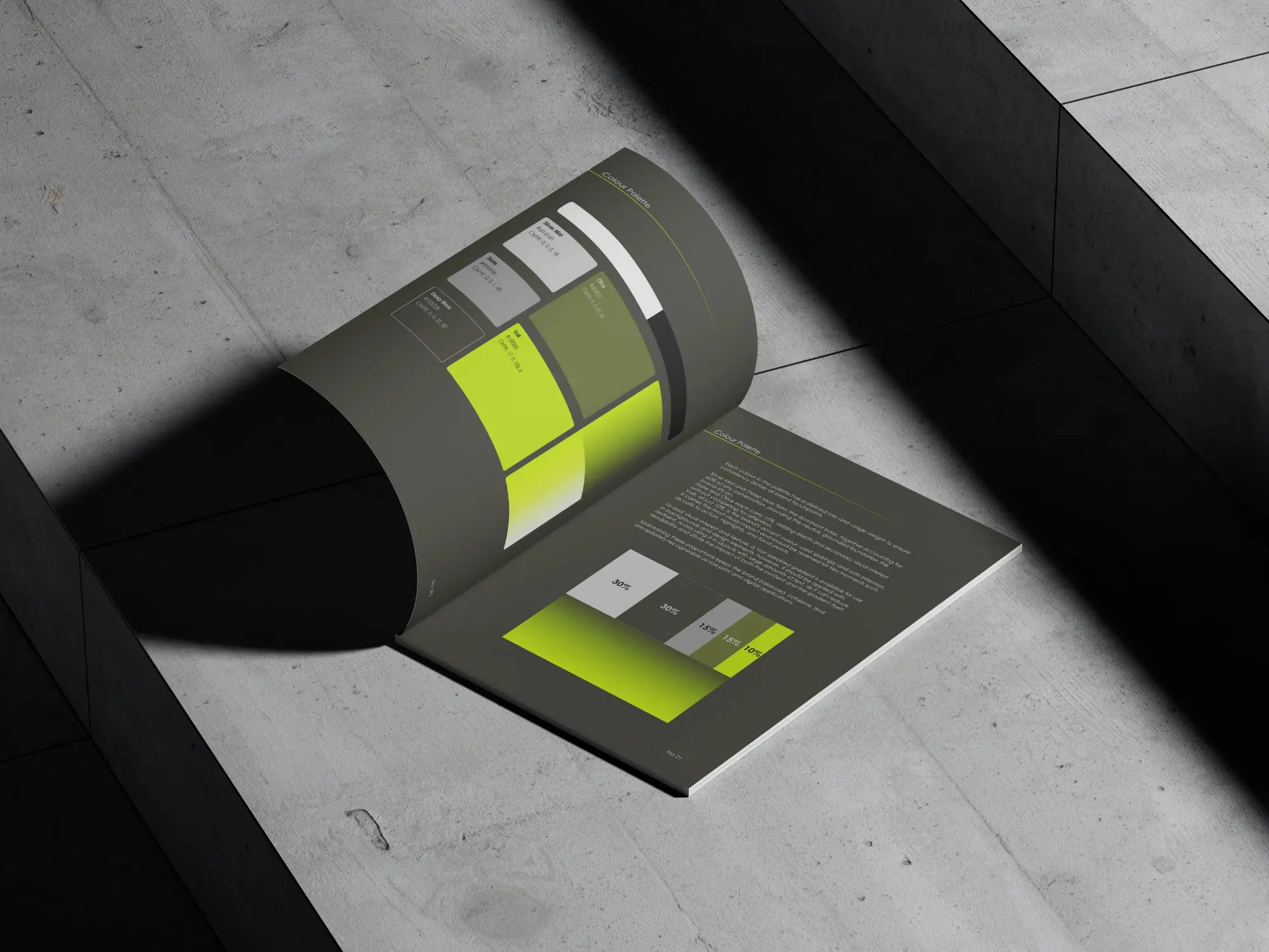
The result is a clean, systematic identity anchored by a bold wordmark, a precise colour system built around a signature Volt green accent, and a typographic framework that communicates clearly and effectively across every application.
The process began with a discovery session to establish how MCF wanted to be positioned: reliable, skilled, and modern. These weren't simply aspirational qualities; they were an accurate reflection of how the business already operated. The identity needed to make that visually clear.
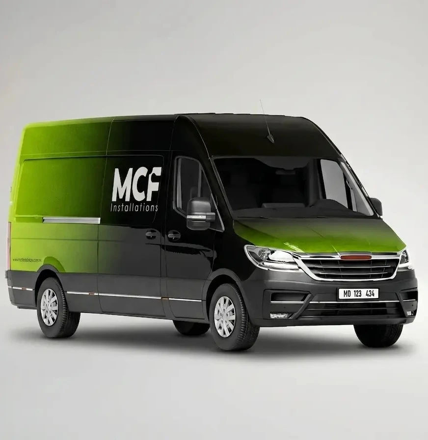
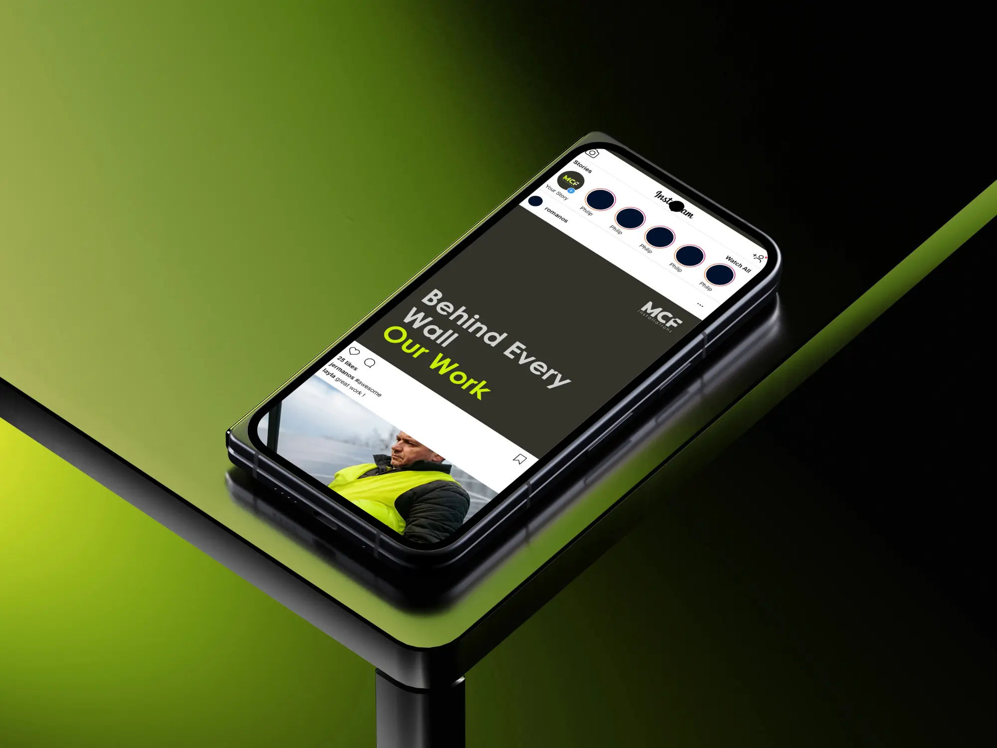
The session also mapped out every touchpoint the brand would occupy day-to-day: site signage, uniforms, vehicles, business cards, and digital quotation documents. Accounting for the full scope of applications from the outset ensured that no decision made early in the process would create problems further down the line.
MCF Installations launched with a complete, production-ready identity that gave the business a professional presence across every touchpoint from day one. The brand has since been applied to vehicles, uniforms, stationery, and client-facing documents - performing consistently across all of them without any modifications to the original system.
The project demonstrated that a trade business operating in a competitive local market can compete on presentation as well as capability. A considered visual identity positions MCF not just as a reliable contractor, but as a business that takes every aspect of its work seriously - including how it shows up.
Credits
Design - Amelie Dimech
Typefaces
Century Gothic
Colours
#C8F000 Volt Green
#1A1A1A Charcoal
#FFFFFF White
Tools
Adobe Illustrator
Adobe Photoshop
Adobe InDesign
Apple Procreate