.png)
Sabiħa
A brand identity for Sabiħa, a Malta-based home décor and accessories store with a love for colour, character, and the unexpected.
Sabiħa had already built a loyal customer base through its curated selection of decorative objects, but the brand's visual presence had not yet caught up with the quality of the product. The brief was clear: create an identity as considered and characterful as the pieces it sells.
The home décor market is saturated with brands competing for the same minimalist aesthetic. Sabiħa's strength has always been its distinctiveness - a playful eye for colour, texture, and objects with personality - and the brand identity needed to reflect that without tipping into noise.
The name itself offered a strong starting point. Sabiħa is Arabic for beautiful, and that meaning shaped the entire creative direction: something warm and feminine, but grounded enough to feel trustworthy. The challenge was finding a visual language that felt joyful and elevated in equal measure, one that could carry across a Shopify storefront, product imagery, social media, and eventual physical packaging.
.png)
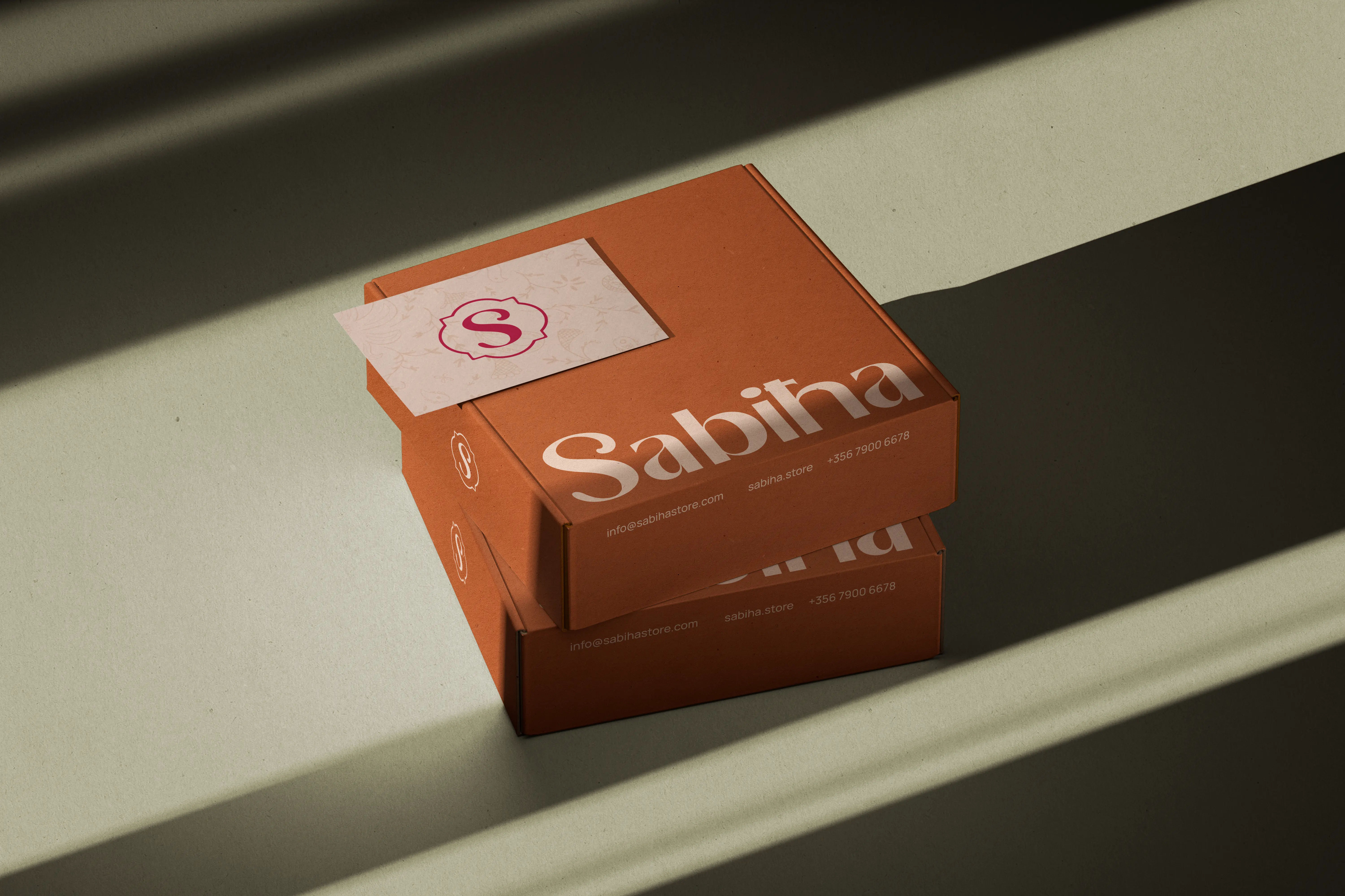
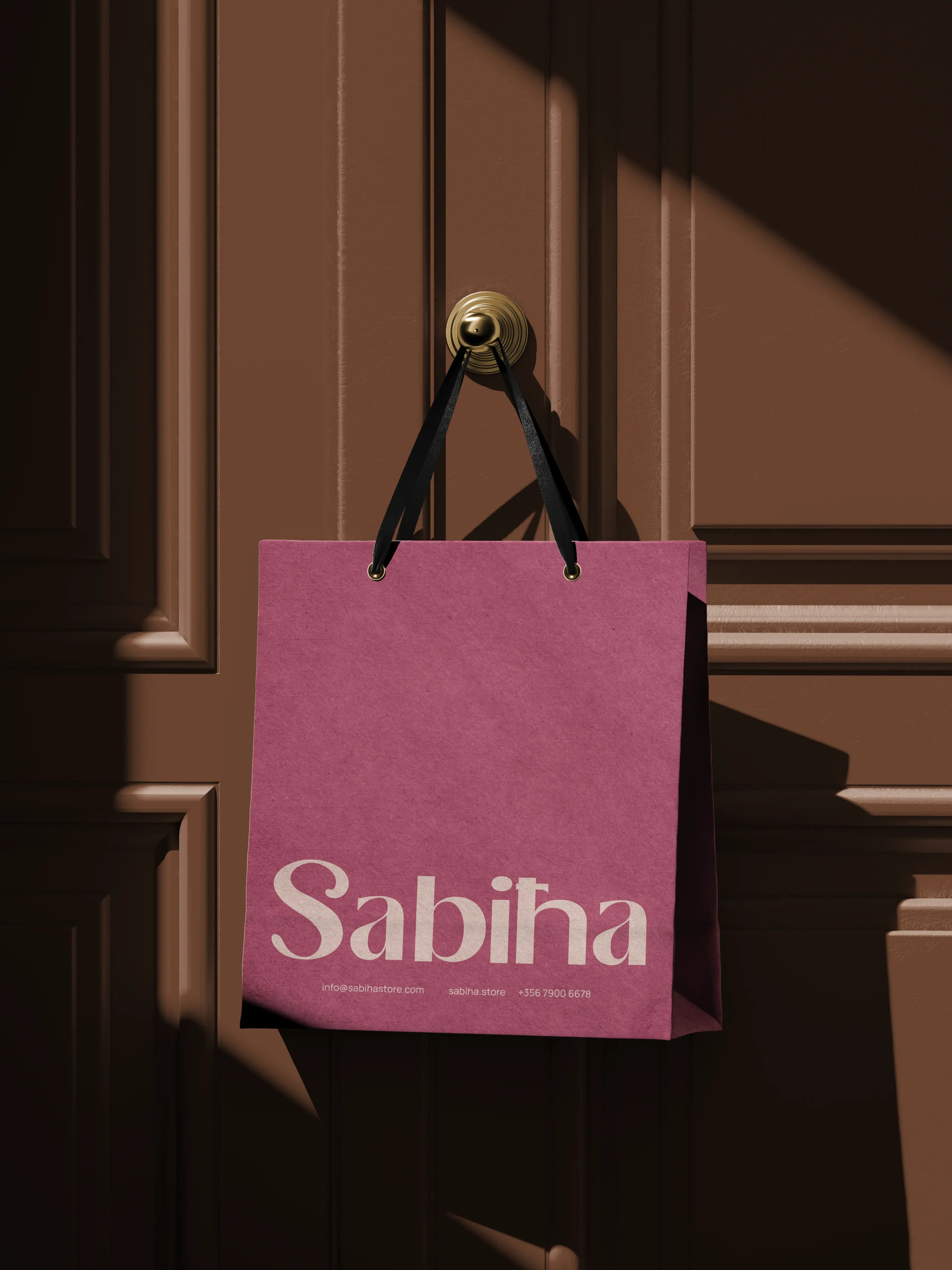
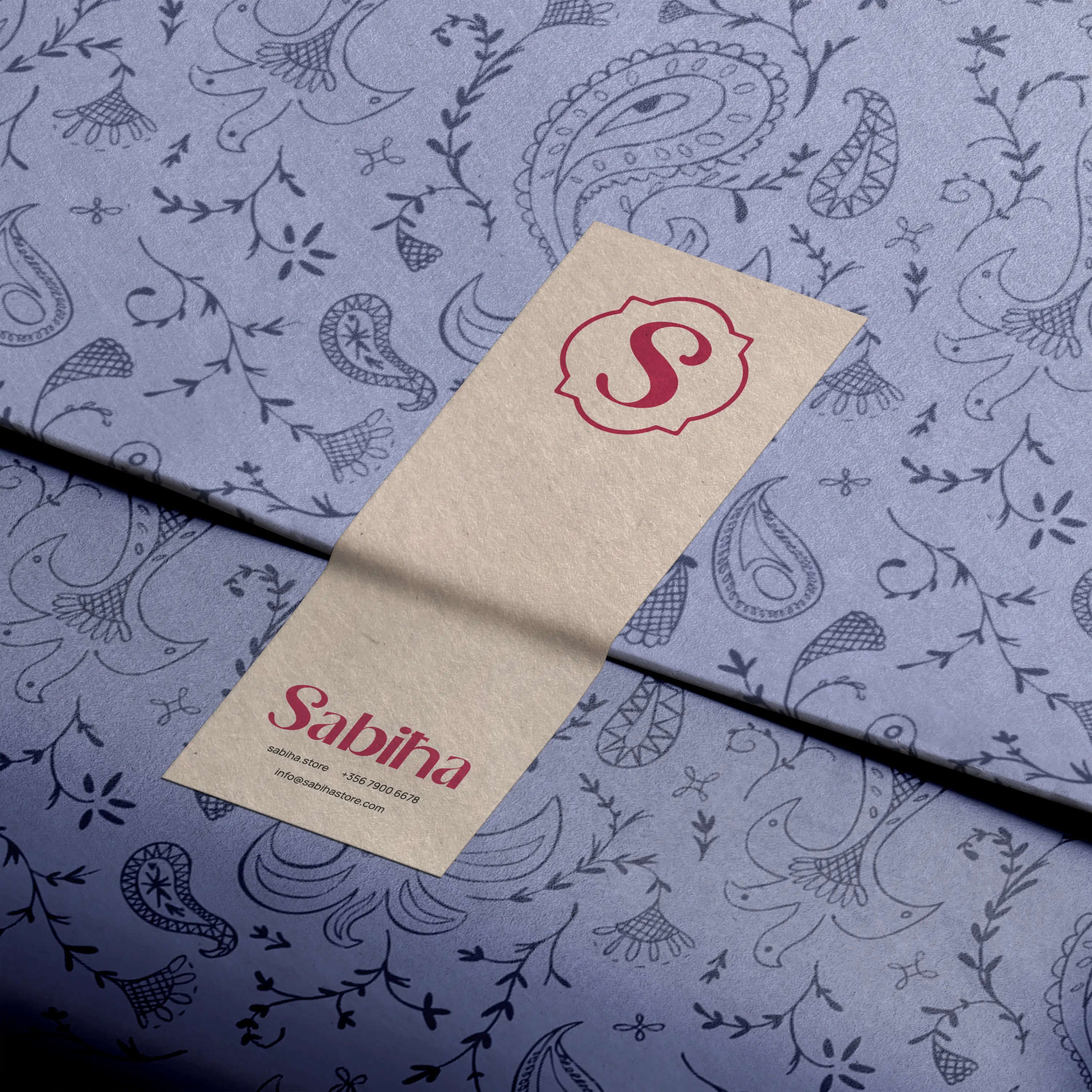
The result is a warm, expressive identity built around a distinctive logo, a carefully chosen typographic system, and a set of guidelines that give the brand a consistent, confident voice across its online store, packaging, and social presence.
The process began with a discovery session focused on understanding Sabiħa's customer, the mood of the store, and the founder's ambitions for the brand. From there, a moodboard was developed to align on visual direction before any design work began, ensuring the final identity would feel owned rather than imposed.
Typography was treated as a primary vehicle for personality. The typeface selection balances elegance with approachability, giving the brand a voice that works equally well in a product header and a handwritten-feel social caption. Colour was kept intentional rather than broad, anchoring the identity with a signature palette that references warmth, richness, and the tactile quality of the objects Sabiħa sells.
The full system was delivered as a complete logo suite in vector format with light and dark reversed versions, a defined typographic hierarchy with web-safe equivalents for the Shopify storefront, a signature colour palette specified in HEX, RGB, and CMYK, and a concise guidelines document covering usage rules, tone of voice, and do/don't examples so the client could maintain consistency independently.
Sabiħa launched its refreshed identity with a complete visual system that matched the care and curation already present in its product offering. The logo and typographic framework translated cleanly to the Shopify storefront, social media, and printed materials, giving the brand a unified presence for the first time. The project reinforced that a small lifestyle business does not need to sacrifice identity for simplicity, and that a well-considered brand system changes how confidently its founder can show up.
.png)
.png)
Typefaces
Manrope
Tools
Adobe Illustrator
Adobe Photoshop
Adobe InDesign